Xplore: Helping find adventure around every corner
Problem to be addressed by the design of an application:
Have you ever been traveling or at a new location and wanted to find something to do or go see? Travelers could be blocks away from a place that would be of interest to them or at a location when an event they might be interested in is taking place without knowing. What could be a solution to this problem?
Xplore is the result of the research, testing, feedback, and prototyping.
Surveying the users
Asking the Users What They Want
The user survey is a way to open up the path to what the user wants and how they will use it
The first step after brainstorming several ideas, concepts, and opportunities was to develop a survey. The results can be found in the link below. Here is a brief summary of the results
There is a large use of Google, Yelp, Foursquare, and TripAdviser to preform random searches. The biggest shortfall is how hard people have to work to find a relevant result for where they are. If someone starts with google and searches “cultural event in Austin TX” which happens to be a very cultural city. The searcher must search through multiple pages, types of events, dates, and times trying to think through what they might want to do. This can take some some fun times when traveling, or someone might not click the right link when there is something nearby. This is similar to searching “Historical Sites Austin TX”. Google has some results, Visit Austin has 30 sites, but what is relevant to the visitor?. I think more so than food, historical and cultural sites and events might be the best direction for this application to proceed. Food can be added in if complements culture of the location. Such as a historical bar with great live music in Austin.
Competitor Analysis
Google Maps, Yelp and Four Square…
Where they fall short, and where the opportunities are
The first step after brainstorming several ideas, concepts, and opportunities was to develop a survey. The results can be found in the link below. Here is a brief summary of the results
There is a large use of Google, Yelp, Foursquare, and TripAdviser to preform random searches. The biggest shortfall is how hard people have to work to find a relevant result for where they are. If someone starts with google and searches “cultural event in Austin TX” which happens to be a very cultural city. The searcher must search through multiple pages, types of events, dates, and times trying to think through what they might want to do. This can take some some fun times when traveling, or someone might not click the right link when there is something nearby. This is similar to searching “Historical Sites Austin TX”. Google has some results, Visit Austin has 30 sites, but what is relevant to the visitor?. I think more so than food, historical and cultural sites and events might be the best direction for this application to proceed. Food can be added in if complements culture of the location. Such as a historical bar with great live music in Austin.
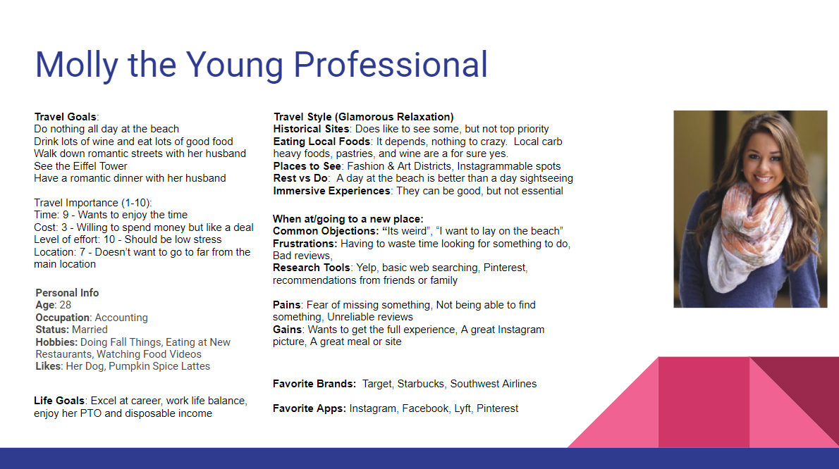
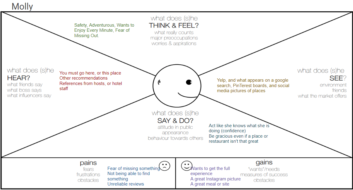
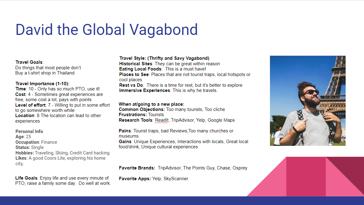
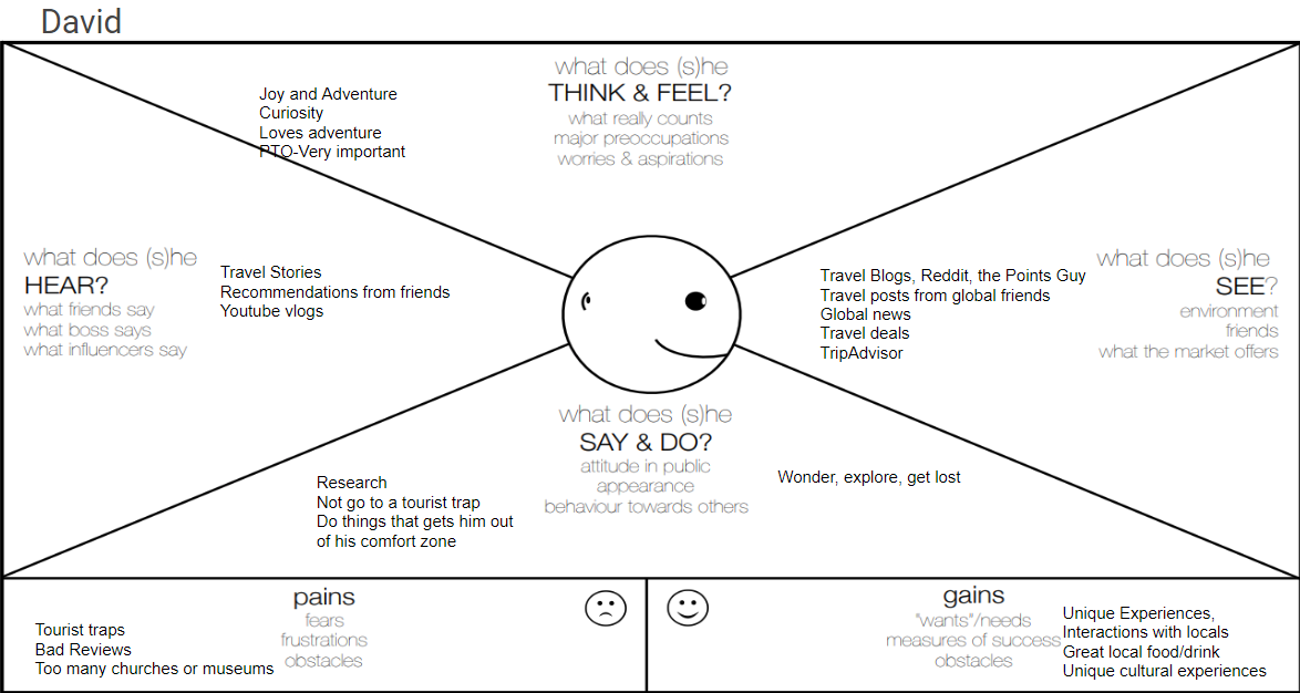
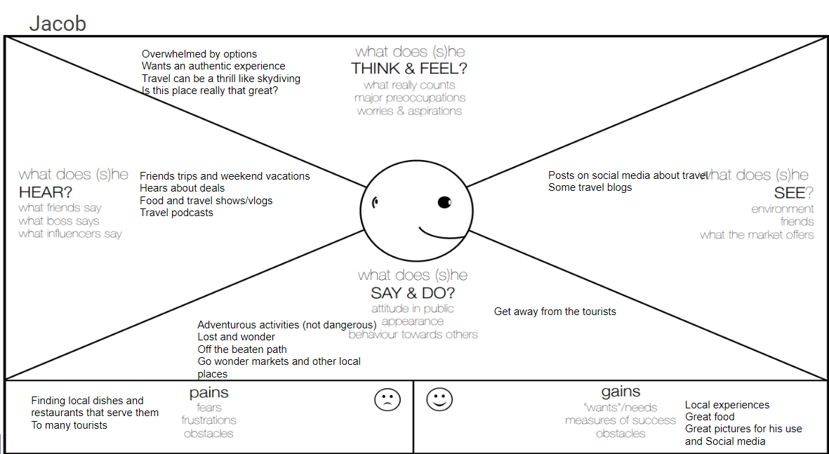
Empathy Maps
After the surveys were conducted three interviews were utilized to follow up as ask more pointed and insightful questions. The empathy maps and personas were the results of the surveys and interviews.
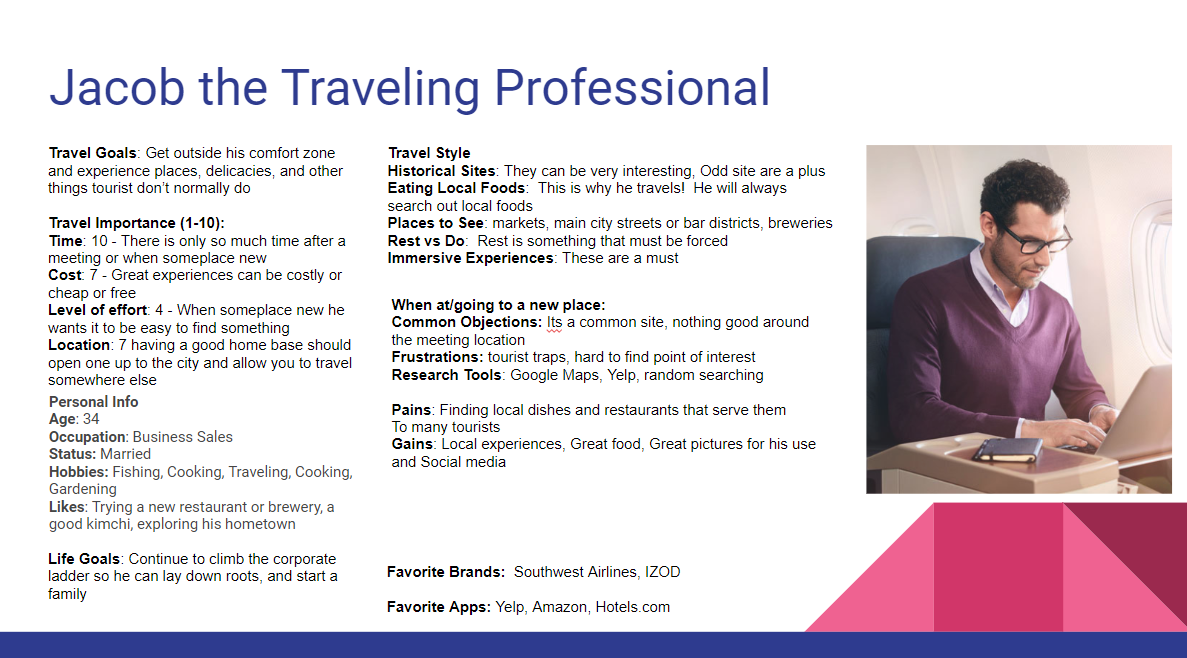
Molly
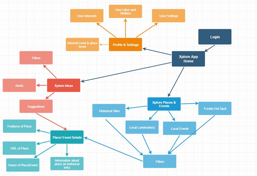
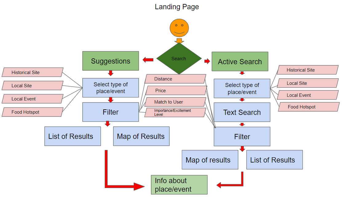
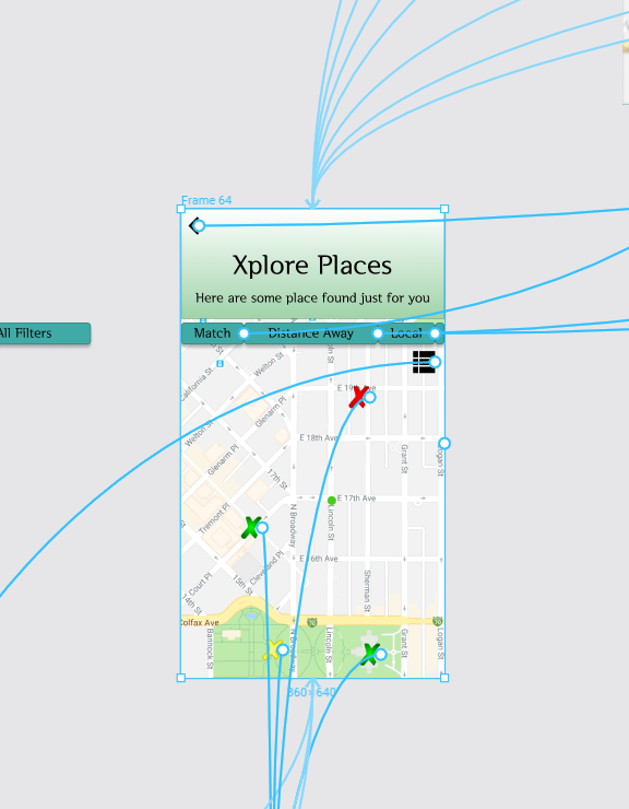
Site Maps and User Flows
The Paths the Users Will Take to Find What to Xplore
The user flows and site maps are going through a process of iteration as the prototype is being tested.
The are some of the current maps and results of the card sort survey. To see the full results follow the link below. The maps visualize the path that users will take to get to relevant results without lots of work and time wasted while they could be Xploring.
Stories and MVP
The stories below help identify what needs to be created, but now how it will look or act. The MVP is a simple MVP that could be shown to users at a very low cost and get valuable feedback before sketching wire frames.
Stories:
Epic: As a user I want to easily find unique local events and locations so that I can fully enjoy my time traveling without wasting time.
Story 1: As a user I want personalized/relevant results without lots of work, so that I can find relevant options easily.
Story 2: As a user I want to learn about local events, so that I can do as the locals do.
Story 3: As a user I want to know important information like cost, time, location, so that I can make an informed decision.
Story 4: As a user I want suggestions, so that I do not miss out.
Features:
Feature 1: Show unique local places, events, historical sites, and other sites
Feature 2: Personalized results
Feature 3: Decision making information ie: price, time(s), location, URL, etc
Feature 4: Suggestions
MVP Idea:
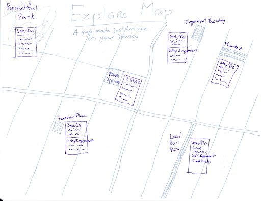
The minimum viable product could be as simple as a manually created map. This can be created by doing a short interview or survey. Then a person can do some research and create a map based on the location and sites or places that could be important to the test user. The sketch below is a simple representation of what this might look like.
User Testing and Feedback
The user is the guide
The most influential factor in this project has been the user. From the survey to testing the prototype. Without them this project would not be successful.
Version X.1 is demonstrated here in prototype. The software used is Figma. The first part was to create the wire frames off the sketches previously shown. Throughout this processes there have been multiple iterations as user feedback is gathered. The colors, menus, organization, and pages have changed or been added or removed. The user has been consulted time and time again to get to this point, and will continue to be as the project evolves. Look a the last section to see the current backlog and some of the changes.
Style Guide
The style guide has evolved like the rest of the project. The idea was to have a look that resembled an old map. This resulted in a style that looked more like a camouflaged military app then an old map. This evolved into a boring grey color scheme. The grey color did not fair well with users. The current version X.1 is the green style guide seen below. A new color scheme is being researched and will be a part of future iterations.
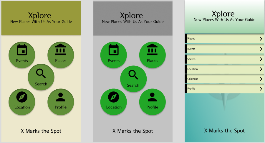
From the start to now
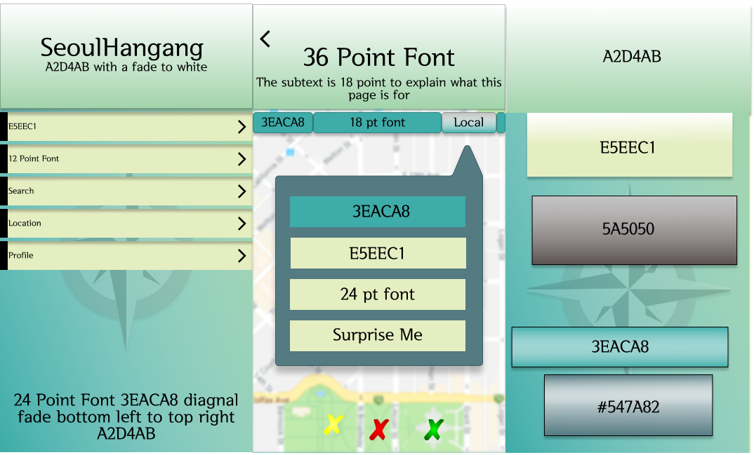
The style guide
User Testing
What the User Thinks Bout Version X.1
Through user testing valuable feedback has been gathered and adjustments are being made
This may be one of the last steps in the process, but it is also just the beginning of the larger process. The users have been a valuable and integral part of the process. Users have gone through the prototype and tested it as per the test plan. The first part was a first look gathering first reactions and questions. The second part was more task oriented with monitoring. Some of the results have included adding a calendar, changing the colors, looking at the font used and sizes, combining sections, and other navigation issues. Below is the full test plan and results.
Backlog
From the User Testing a Backlog Has Been Created
Throughout the process lots of valuable feedback has been received. While some has been addressed, other items cannot be at this time.
Here are some things that have been addressed and fixed and some that are in the backlog. For a full and up to date list follow the link. Some of the items that have been fixed are still being iterated, so the item can be on both fixed and in the backlog.
Fixed: Color Scheme, Combining User Interests and Things I Enjoy, Visual Filtering of Xs,
Backlog: Add Calendar, Match Signal in List View, Condense Content in List View, Scroll Rather then Place/Event Menu, Site Map